

Counter Lighting: How Light Connects Orientation and Appetite
At a counter, a decision often happens within a few seconds. A glance at the offer. A glance at the display. A brief moment of contact with staff.
This is exactly where the task of counter lighting begins. It has to make food legible, support workflows, distinguish brands and guide visitors — without turning the room into a glaring sales floor.
A good counter isn't automatically the brightest surface in the room. It's the spot where the offer, the staff and the workflow are understood the fastest.
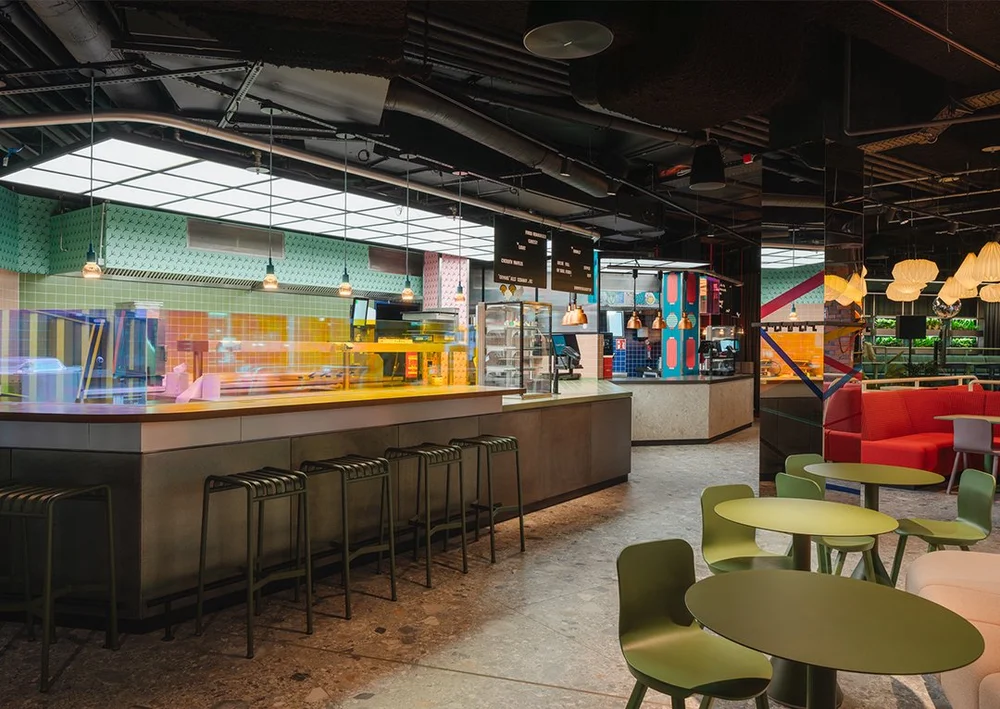
This is where architecture, hospitality, brand, technology and human movement meet.
Order.
Wait.
Pay.
Pick up.
Visitors don't look at a hospitality counter like an exhibit. They're looking for answers.
Where does the line start? What's on offer here? Where do I order? Where do I pick up my food? Is this concept fast, high-quality, healthy, affordable or something special?
Counter lighting should answer these questions before signage has to explain them.
That doesn't require maximum brightness. It requires a clear hierarchy between display, work surface, menu, brand and surroundings.
A counter can be technically compliant with lighting standards and still feel hard to read. In that case, there's enough light present — just not where the decision is made.
Counter areas are visually dense. Products. Materials. Logos. Displays. Different light colors.
For a counter to stay clearly legible, the light shouldn't demand attention everywhere at once. It has to create order.
A distinctive vertical surface, a clearly legible logo, or a characteristic light feature creates orientation from far away.
Food, ingredients and materials need high color rendering and a direction of light that reveals texture instead of flattening it.
Cutting, plating, taking payments and cleaning need functional light — without the work zone overpowering the dining room.
Light can mark waiting zones, ease movement, and prevent guests from standing directly in front of the pickup point.
Brighter doesn't automatically sell better.
When a counter is significantly brighter than its surroundings, it can indeed become visible from a distance. Up close, though, harsh reflections, blown-out menu surfaces and fatiguing contrasts quickly appear.
Glossy tiles, stainless steel, glass display cases, lacquered fronts and digital menus are especially critical. Any of these surfaces can reflect light straight into guests' eyes.
The better strategy is controlled brightness. Vertical surfaces make the counter legible. Directional light gives food depth. A calmer surrounding creates contrast.
The counter doesn't need to outshine everything.
It needs to be understood faster than its neighbors.
Illuminance alone says little about how appetizing a display actually looks.
Light straight from above creates harsh shadows under eyes, hands and products. Light from behind can turn staff and goods into silhouettes. Frontal light can cause glass display cases to reflect.
That's why good counter lighting is often planned slightly angled, offset or crossed. Food gains volume. Hands stay visible. Faces look natural. Reflections can be kept out of the most important sightlines.
What matters is the guest's actual viewing angle. Not just the floor plan. Not just the ceiling view.
With open kitchens, another perspective comes into play: the cooks themselves become part of the presentation. Their workspace needs precision, but shouldn't feel like a coldly lit production zone.
Don't just test the fixture. Test the real interplay of light, surface and product.
- an actual dish or realistic product colors
- the intended front and work surface
- glass, stainless steel and digital menu surfaces
- the viewing angle from the queue
- the later evening dimming level
A good sample test doesn't check whether light is present. It checks whether the right thing becomes visible.
People judge freshness largely by sight. Golden-brown crusts. Red sauces. Green vegetables. Skin tones. Wood. Ceramics.
A light source can be bright enough and still render these colors dull or unnatural. This is exactly why high color rendering matters so much in counter lighting.
Warm reds, oranges and browns are especially critical. They determine whether burgers, baked goods, meat, sauces and many warm dishes look appetizing.
Color temperature shouldn't be chosen in isolation, though. 3000 Kelvin can form a warm, clear starting point in many hospitality concepts. But material colors, daylight, brand world and the food offer all play a role too.
.jpg)
A light feature can be recognizable from a distance, provide orientation indoors, and later recur across additional locations.
This is how light becomes part of a scalable design system.
Hospitality counters have to fulfill many tasks at once in a limited space. The obvious reaction is often: more color, bigger logos, brighter displays.
But a strong brand doesn't necessarily need more visual elements. It needs a recognizable principle.
That can be a particular light color. A graphic line. A rhythm of pendant lights. An illuminated back wall. Or a characteristic way of framing the pickup counter.
At Flip-N-Fry, linear fixtures form a graphic pattern that's already perceptible from outside. The light therefore not only supports the use of the space but becomes part of the brand identity itself.
The key distinction: a brand element has to be repeatable without looking identical at every location.
Bright displays draw attention. At the same time, they can destroy any subtler lighting effect around them.
A menu screen that works fine at midday can become too dominant in the evening. A glossy protective panel can reflect ceiling fixtures. White screen areas can visually darken faces and products next to them.
That's why digital menus shouldn't be treated as independently glowing objects. Their brightness belongs within the overall lighting concept.
- automatic or scene-dependent brightness adjustment
- anti-glare surfaces and controlled viewing angles
- enough distance from directional spotlights
- a clear hierarchy between menu, product and brand surface
- testing in daylight and during evening service
The menu is allowed to inform. It shouldn't outshine the entire counter and its surroundings.
A hospitality counter doesn't have just one correct lighting mood.
At lunch, orientation happens fast, footfall is high, and the available daylight is often noticeably stronger. In the evening, dwell time, table lighting and contrast become more important. During events, usage changes again.
Static counter lighting can barely capture these shifts convincingly. Separate, dimmable light groups and clearly defined scenes make more sense.
Morning · Lunch · Evening · Event
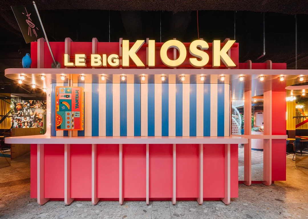
At Le big TamTam, four different lighting scenarios were programmed. The system reacts to time of day and usage: brighter and more generous during the day, warmer and higher-contrast in the evening.
The advantage isn't the technical effect itself. The advantage is that the same architecture remains correctly legible at different times of day.
Many problems don't come from bad products. They come from a lack of coordination.
- the counter is treated as one single, evenly bright surface
- task lighting and guest-facing lighting sit on the same circuit
- fixtures reflect in display cases, tiles or menu screens
- staff faces stay darker than the work surface
- food is lit exclusively straight down from above
- logo, menu and product compete at equal brightness
- the pickup zone can't be distinguished from the ordering zone
- the light color doesn't match the materials and the offer
- evening service keeps the same brightness as the lunch rush
- maintenance and future adjustments aren't considered
The most expensive mistake is often planning too late. Once the counter build, ventilation, sprinklers, displays and ceiling systems are already fixed, only leftover space remains for good lighting positions.
Not the other way around.
.jpg)
An efficient fixture isn't very sustainable if it has to be fully replaced after a single fault.
Hospitality concepts change. Offers shift. Menus get reorganized. Counters get rebuilt. Brand identities keep evolving.
A rigid lighting system therefore often ages faster than the fixtures themselves.
Replaceable optics, accessible drivers, flexible track systems and independently controllable light groups make later adjustments easier. The counter can be realigned without replacing the entire lighting system.
The Impact Hub project shows a related principle: standard components were combined into a project-specific fixture. Reused wooden slats, diffuse light components and tested shielding combine design, glare control and repairability.
For counter lighting, this means: not every custom solution has to be an irreplaceable special part. Good planning can be distinctive and maintainable at the same time.
Before fixtures are selected, the project team should be able to answer the key questions about the counter.
- From what distance does the counter need to be recognizable?
- What should be seen first: logo, product, kitchen or menu?
- Where do ordering, payment, waiting and pickup begin?
- Which dishes and colors need to be rendered especially well?
- Which surfaces reflect or gleam?
- How do daylight and visitor frequency change over the day?
- Which work areas need their own functional lighting?
- Which elements need to be dimmable and separately controllable?
- How can the system be adapted for a new offer or renovation?
- Who handles the fine-tuning on site after installation?
When these answers are available early, counter lighting becomes more precise. Fewer fixtures have to do more work. Reflections get caught before installation. The brand stays visible without visually overloading the space.
There's no universally correct light color. Warm white light around 3000 Kelvin often works well because it makes food and materials look inviting. What matters most, though, is the food offer, the brand colors, the daylight, and the counter's surfaces.
The counter should read more clearly than its surroundings, but it doesn't need to be maximally bright across the board. Balanced contrast, glare-free sightlines and a clear weighting between product, menu, work surface and brand matter more than a single lux value.
High color rendering helps show the natural colors of ingredients, warm dishes, drinks and materials credibly. Poor color rendering can make even high-quality products look dull, grayish or unnatural.
Yes, a counter should get a clearly defined lighting zone of its own. At the same time, it has to be coordinated with the general lighting, adjacent seating areas and the architecture. Individual accents and the overall lighting concept should therefore be planned together.
Ideally in parallel with the counter and interior design. That way, fixture positions can be coordinated early with ventilation, sprinklers, displays, built-in furniture, power supply and sightlines — before technical constraints rule out the best solutions.
The counter is the moment a spatial concept turns into a concrete decision.
Studio De Schutter develops lighting concepts for hospitality counters, bars, restaurants, retail and complex public interiors — from the first lighting idea through mock-ups and technical planning to on-site fine-tuning.
For counters that aren't simply brighter.
But clearer.
Contact Us:
