

Food Court Lighting: Balancing Brand Identity and Shared Space
A food court can contain excellent restaurants and still feel like a collection of unrelated counters. Each brand wants to be visible. Each operator wants its own character. Yet guests experience the space as one place.
This is the central challenge of food court lighting: creating enough distinction for individual concepts without allowing the shared environment to dissolve into visual competition.
Successful lighting does not choose between brand identity and shared space. It builds a hierarchy in which both can exist.
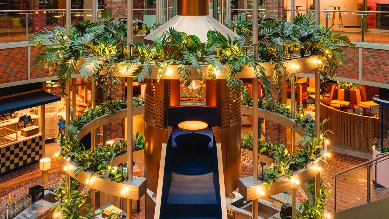
The shared architecture should remain legible before any restaurant, kiosk or bar adds its own visual language. Guests need to understand where to enter, where to order, where to wait and where to sit.
Only then should individual brands become more expressive.
Spatial lighting
Establishes orientation, circulation, seating comfort and a consistent relationship between the different areas.
Brand lighting
Gives each gastronomic concept its own recognisable character through local accents, decorative elements and material-focused light.
Task lighting
Supports food preparation, menus, service counters, payment areas and the people working behind them.
Food court lighting is often approached counter by counter. One tenant selects pendant lights. Another introduces illuminated signage. A third adds powerful spotlights. All decisions may work individually, yet together they create a room without visual order.
The better starting point is the architecture.
Before discussing decorative fixtures, the lighting concept should clarify:
- Which elements must remain visible from a distance?
- Where do circulation routes cross?
- Where do queues form?
- Which seating areas should feel active, calm or intimate?
- Where does daylight enter—and where is it almost absent?
- Which architectural elements can become orientation points?
The shared layer should not be anonymous. It should have a clear spatial character of its own. But it must be calm enough to hold the more expressive identities of the individual food concepts.
A multi-brand food hall should not look as though one lighting system has simply been repeated above every counter. Differences are important. They communicate variety and help guests distinguish between cuisines, service styles and price levels.
Yet difference becomes useful only when a few common rules remain intact.
These rules may define:
- A coordinated range of light colours
- Maximum brightness levels for signs and menu boards
- Glare control within shared sightlines
- Mounting zones for decorative luminaires
- A common control and dimming strategy
- Minimum light quality for food, materials and faces
Within this framework, each operator can still work with its own luminaires, colours, graphics and focal points.
The aim is not visual uniformity. It is controlled contrast.
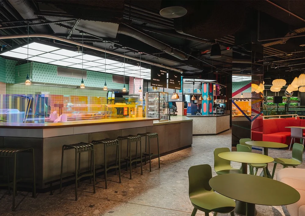
Guests do not experience a counter only through the food displayed on it. They see the people preparing it. The materials behind it. The menu. The movement. The exchange between kitchen and customer.
This makes the counter one of the most demanding areas in food hall lighting design.
Several tasks overlap:
- Food must appear fresh and natural.
- Staff need functional light for preparation and service.
- Faces should remain visible rather than falling into shadow.
- Menus and payment areas must be readable without becoming the brightest objects in the room.
- The counter needs enough contrast to be recognised from the circulation area.
Decorative pendant lights alone rarely solve this. They may create a recognisable image, but they do not necessarily provide useful vertical light or sufficient illumination on the working surface.
At Le big TamTam in Hamburg, dimmable tunable-white panels float above the chefs. They make the people behind the counters visible while responding to the limited natural daylight within the lower level of the Hanseviertel.
The chef becomes part of the spatial experience.
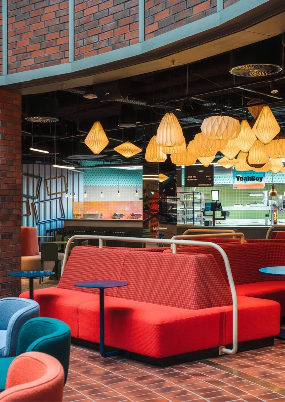
Counters need presence. Shared seating areas need balance.
When tables are illuminated with the same intensity as service zones, the entire food court remains visually active. Guests may find a seat, but the room never gives them permission to settle.
A better concept creates a change in visual rhythm:
Table surfaces should remain readable. Food should look appealing. Faces should not disappear into darkness. At the same time, the seating zone can use softer contrasts, lower visual intensity and more localised pools of light.
This difference is subtle, but decisive. It separates the act of ordering from the act of staying.
A space can contain a large amount of light and still be difficult to understand. Uniform brightness removes hierarchy. Every surface competes equally.
Visibility comes from relationships: bright against dark, foreground against background, vertical against horizontal and active zones against quieter ones.
Good food court lighting does not illuminate everything equally. It makes the important elements easier to read.
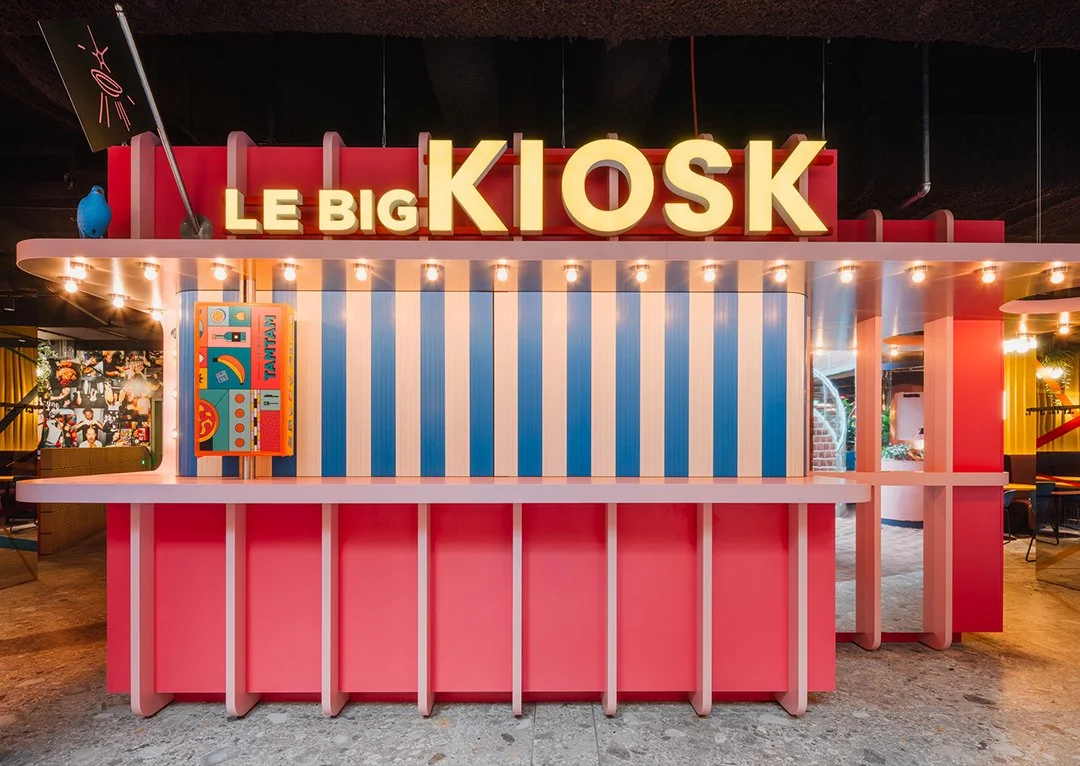
Kiosks, pop-up counters and compact retail elements are often positioned within circulation zones. They have less architectural volume than a full restaurant unit and therefore rely more heavily on visual precision.
The mistake is to compensate with excessive brightness.
A small counter becomes visible more effectively when:
- The sign is clearly separated from the background
- The front surface and merchandise receive focused light
- The service opening remains visually accessible
- The surrounding floor is not brighter than the kiosk itself
- Decorative lighting reinforces the architecture rather than covering it
The result can be expressive—even playful—without disturbing the visual order of the wider food court.
A food court is rarely used in the same way from opening until closing.
Morning visitors need clarity and orientation. Lunchtime brings higher density, faster movement and longer queues. In the evening, the same space may need to feel warmer, more intimate and closer to a restaurant or bar. Events introduce another layer altogether.
One static lighting scene cannot respond well to all of these conditions.
At Le big TamTam, Studio De Schutter programmed four lighting scenarios:
Morning · Midday · Evening · Events
During the day, artificial light supplements the daylight entering through the glass dome and keeps the shared dining space open and generous. In the evening, the balance shifts towards warmer, more focused light with stronger accents around tables and hospitality areas.
The room does not simply become darker.
Its hierarchy changes.
Food courts change frequently. Operators move. Menus evolve. Furniture is replaced. Pop-up formats appear. Events require different arrangements. A rigid lighting concept may look complete on opening day and become obsolete soon afterwards.
Flexibility therefore needs to be built into the base system.
Adjustable track lighting, interchangeable optics, adaptable beam distributions and scene-based controls allow the concept to respond without replacing the entire installation.
This is not only practical.
It supports a more sustainable approach by extending the useful life of the lighting equipment and reducing the need for unnecessary replacements when the hospitality concept changes.
- Every tenant plans its lighting independently
- Brightness is used as the primary method of attracting attention
- Decorative luminaires are expected to provide all functional light
- Food counters and shared seating receive the same lighting treatment
- Menu boards and signs overpower people, materials and food
- No transition is planned between daylight and evening operation
- The lighting cannot adapt when tenants or layouts change
- Technical equipment is visible, but architectural features remain unreadable
None of these mistakes necessarily makes the space unusable.
They make it feel less considered.
The answer is not to reduce every restaurant to the same visual language.
It is to design a strong shared framework.
Circulation, orientation, seating and architectural elements form the constant layer. Individual counters then introduce variation through focal light, decorative luminaires, colour, scale and material.
Guests perceive variety, but they do not lose their understanding of the room.
Different voices. One composition.
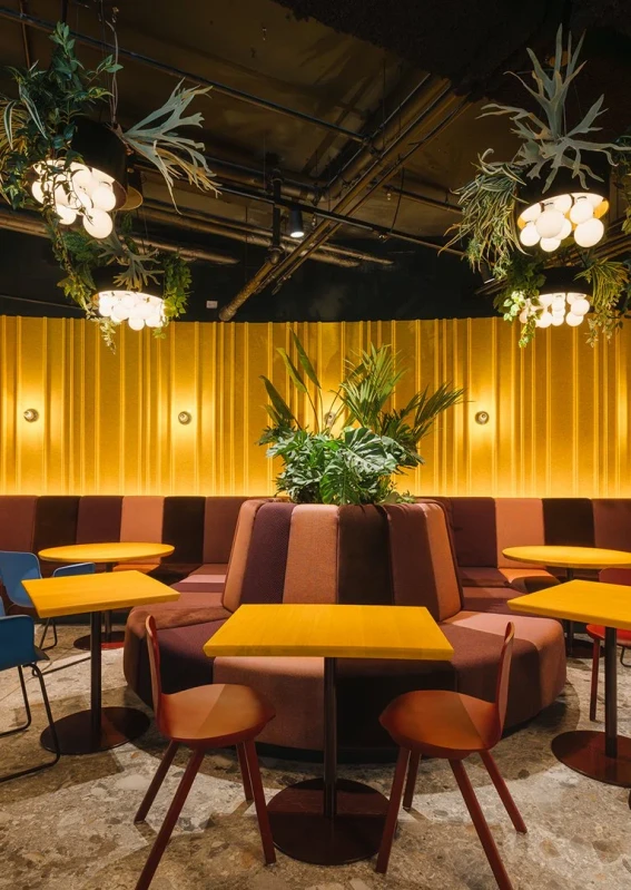
Located in the previously closed basement of Hamburg’s Hanseviertel, Le big TamTam combines five gastronomic concepts, a central bar and an event stage within one colourful food market.
The lighting concept uses the central bar as a long-distance orientation point. More than one hundred cabochons and five illuminated planting rings make the structure visible across several levels. A section of the installation was constructed as a full-scale 1:1 mock-up to coordinate its lighting precisely with the architecture and listed building requirements.
General track lighting provides an adaptable foundation, while custom-designed luminaires and individual lighting elements give the different food concepts their own character. Separate lighting scenes respond to daylight, evening use, events and the needs of the integrated planting.
Explore the complete Le big TamTam lighting project →
A successful concept begins before the individual counters select their luminaires.

Contact Us:
