

Good retail lighting does not begin with the question of how bright a space needs to be.
It begins with what a visitor should understand first.
Where is the entrance? Where is the offer? What belongs to the brand? What is background? And what should remain memorable?
The term retail lighting is often understood more narrowly than commercial spaces actually work. The same principles apply wherever offer, brand and architecture need to become visible together – from traditional retail environments to food concepts and publicly accessible areas within a shopping mall.
The decisive factor is therefore not brightness alone. It is visual hierarchy.
If luminaires are selected first, the process often begins one step too late.
Before positions, optics or colour temperatures are defined, it should be clear which tasks are actually competing for attention.
Where should the eye go first?
Entrance, product, counter, display and spatial depth do not require the same visual priority.
What really needs to look good?
Colours, materials, food and surfaces react very differently to light quality and direction.
What remains recognisable?
Light can develop a recurring graphic language – as consistently as colour, typography or furniture.
What is allowed to remain background?
Good lighting design decides not only what becomes visible, but also what deliberately receives less attention.
A commercial space is rarely perceived as one complete image.
Visitors scan it.
Within seconds, several questions arise:
Where in? · Where next? · What to look at? · Where to stay?
Light can structure this sequence.
A brighter vertical surface can mark a destination. A line of light can indicate movement. A local pool of light can define a place to stay. A darker intermediate zone can separate two areas.
This works long before a single product is illuminated.
That is why it makes sense to think about lighting spatially from the earliest design stages.
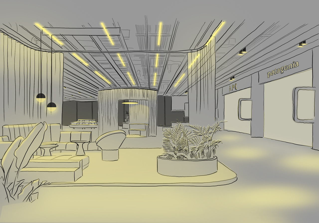
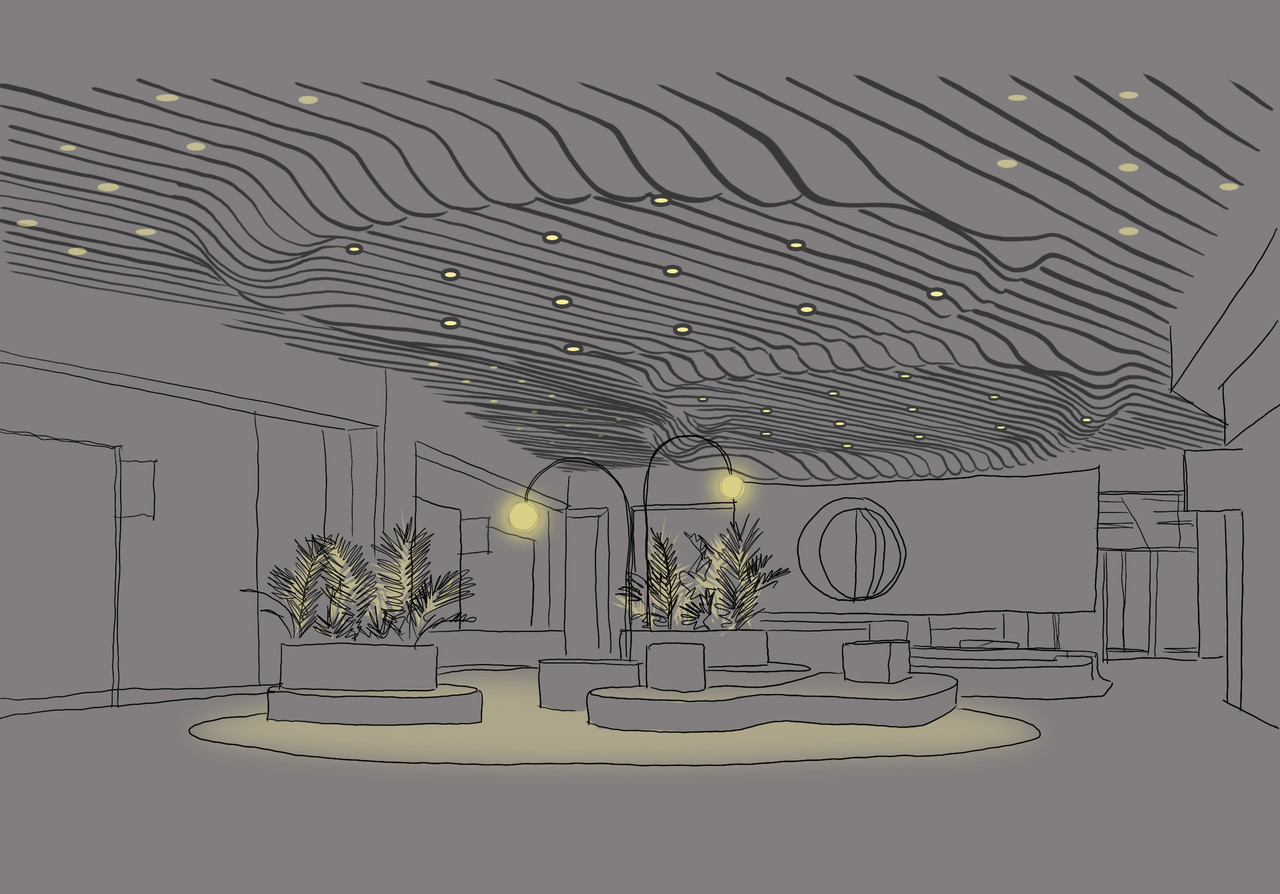
This is one of the most important distinctions in professional retail lighting.
There is no useful universal brightness level that automatically guarantees attention.
What matters is the relationship to the surroundings.
A display can appear dominant with relatively little light if its background remains quiet.
Conversely, very high illuminance can become ineffective if walls, ceiling, floor and neighbouring surfaces are equally bright.
An accent is created through difference.
Not through maximum output.
People judge brightness strongly through surfaces within their direct field of view.
Walls. Displays. Shelves. Back panels. Faces. Signage.
This is why vertical lighting can often achieve more than simply adding extra light to the floor.
A well-lit rear wall gives the eye a reference point. Illuminated vertical elements create depth. Bright products against a deliberately quieter background automatically gain more presence.
Retail lighting should therefore not only ask: How much light reaches the merchandise?
It should also ask: Which surfaces create the visual context around that merchandise?
In commercial interiors, lighting is often treated as a supporting element.
Architecture first. Corporate design second. Lighting at the end.
Yet lighting itself can become part of the brand architecture.
It becomes particularly interesting when a lighting element not only looks good, but is also repeatable.
A line of light. A particular rhythm. A characteristic pendant. A recurring colour temperature. A specific relationship between bright and dark surfaces.
Such a principle can evolve from one location to another without copying the exact same interior every time.
At the Berlin restaurant Flip-N-Fry, this idea became part of the design.
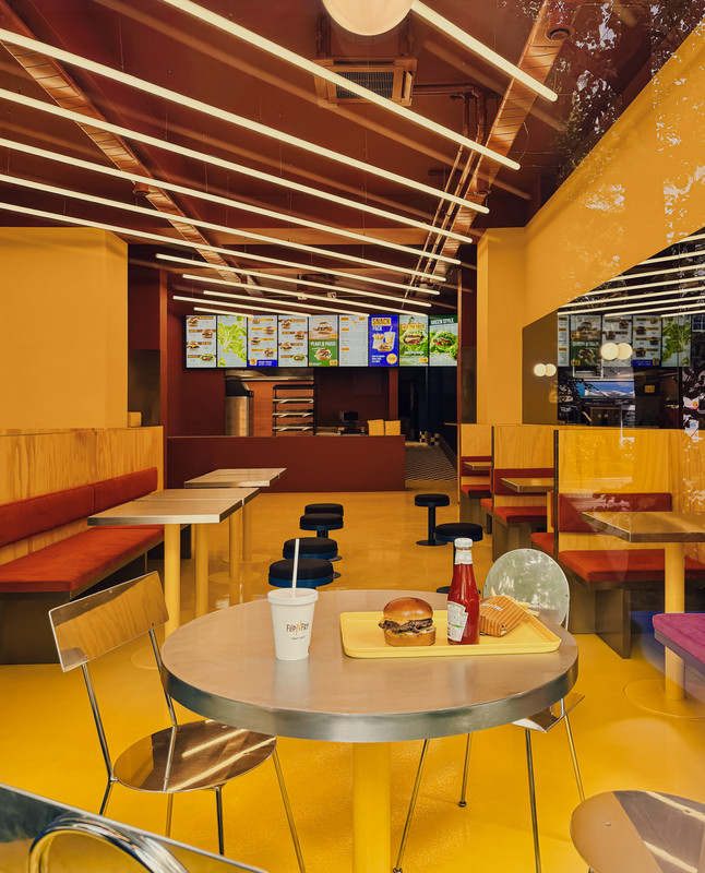
Linear luminaires on the ceiling form a graphic pattern that is already visible from the street through the windows. Light therefore becomes more than interior illumination – it becomes a recognisable visual signal of the brand.
.jpg)
In commercial spaces, it is not enough for an object simply to be visible.
It also needs to look right.
Skin tones. Timber. Textiles. Metal. Packaging. Food. Strong wall colours.
All of these materials react differently to the spectrum of a light source.
At Flip-N-Fry, mock-ups were used to compare the interaction between brightness, colour temperature and material directly.
The final scheme works with 3000 Kelvin and a colour rendering index above 95.
This supports both the terracotta and yellow tones of the architecture and the natural colours of burgers and fries.
That is the point:
Good retail lighting should not simply provide enough light. It should preserve the colour concept of the space.
.jpg)
It sounds obvious.
Yet in practice, this is one of the most common mistakes in retail lighting.
Product bright. Wall bright. Ceiling bright. Logo bright. Counter bright. Circulation bright. Shop window even brighter.
The result is not hierarchy, but a consistently high level of visual noise.
A good concept therefore assigns deliberately different brightness roles.
- What forms the background?
- What supports orientation?
- What should attract attention?
- What requires especially good colour rendering?
- Which surfaces are allowed to recede?
Only once these roles are clear does the lighting become precise.
Not every light source needs to disappear.
Particularly in brand-oriented interiors, a visible luminaire can perform a strong spatial role.
The important thing is that it does not look like technical equipment added afterwards.
At Flip-N-Fry, the linear luminaires do not follow a neutral ceiling grid.
They cut diagonally across the ceiling. They overlap. They create movement. They react to the bold colour architecture.
The ceiling therefore becomes an active part of the brand experience.
.jpg)
Reflective materials play an enormous role in commercial interiors.
Glass. Mirrors. Polished stone. Lacquer. Metal. High-gloss floors.
These materials can multiply light.
Or multiply glare.
In the Flip-N-Fry concept, the glossy epoxy floor deliberately becomes part of the lighting effect. Bright surfaces and light lines are reflected and create additional depth and movement.
Wall luminaires also reappear in dark mirrors.
Reflection therefore becomes more than a side effect of lighting – it becomes part of the composition.
This is why luminaire positions should never be considered only in plan.
Another decisive question is: What does the visitor see in the material?
Static lighting does not respond to the fact that its surroundings are constantly changing.
Daylight rises. Daylight falls. Shop windows become mirrors. Exterior spaces become darker. Interior spaces suddenly appear much brighter.
This change becomes particularly visible in long floor plans.
Flip-N-Fry receives daylight from only one side.
Artificial lighting supplements the decreasing daylight and keeps the depth of the space legible.
This does not mean artificial light has to completely replace daylight.
It should supplement natural light precisely where its effect begins to disappear.
This is one of the key differences between simply illuminating a space and designing with light.
Lighting control is often discussed only at the end of the planning process.
Yet it determines whether a good concept survives everyday operation.
A space does not need to operate at the same output every hour.
- Daylight can reduce the need for artificial light.
- Less frequently used areas can respond according to demand.
- Opening and cleaning periods require different scenes.
- In the evening, the balance between spatial and accent light can change.
- Luminaires do not need to operate when nobody is using the area.
At Flip-N-Fry, motion sensors, timers and daylight sensors reduce unnecessary operating hours.
At the same time, the system was designed to be modular, replaceable and upgradeable.
Sustainable retail lighting therefore does not begin with an efficient LED module.
It begins with the question of when light is actually needed – and how long the installation can continue to be used meaningfully.
- illuminating the entire space as uniformly as possible
- trying to highlight products only through high illuminance levels
- ignoring walls and other vertical surfaces
- selecting colour temperature independently from material and product
- treating colour rendering only as a technical datasheet value
- positioning luminaires according to the ceiling grid rather than actual use
- reducing brand lighting to illuminated logos
- ignoring reflections in glass, mirrors and glossy floors
- planning shop windows and interiors as separate systems
- using the same lighting scene during the day and evening
- adding more luminaires whenever an area does not work
- ignoring maintenance, replaceability and future adaptation
A good concept does not need more light everywhere.
It needs clearer decisions.
Many typical mistakes can be avoided if lighting for a commercial space is developed in a clear sequence.
Where does the visitor arrive? Which destinations need to be visible from which perspective?
Product, offer, counter, architecture and orientation should not all receive the same visual dominance.
Colour temperature, colour rendering, reflection and texture should be tested with real materials and products.
Define the background brightness first, then add accents selectively.
Consider whether light itself can become a recognisable element instead of simply illuminating an existing design.
Consider differences between façade zones, spatial depth, daytime conditions and evening use from the beginning.
Define scenes, sensors and operating times before everyday use reduces the installation to one single setting.
Review accents and brightness levels after completion using the real materials, furniture and sightlines.
Finally, check which luminaires are genuinely necessary and which were simply added along the way.
Flip-N-Fry is a 120-square-metre restaurant in Berlin-Schöneberg, realised in 2025 in collaboration with Bruzkus Greenberg.
The architecture works with intense terracotta, yellow and blue tones, strong material contrasts and individually developed furniture.
The lighting does not respond neutrally.
Graphic linear luminaires structure the ceiling and create a visual signature that is already visible from the street. 3000 Kelvin and colour rendering above CRI 95 support both the bold architectural colours and the presentation of the food.
Mirrors and glossy surfaces are deliberately integrated into the lighting effect. At the same time, motion sensors, timers and daylight sensors reduce unnecessary energy use, while the modular construction makes maintenance and future adaptation easier.
Product, brand and architecture are not illuminated one after another. They are planned as one visual system.
Explore the complete Flip-N-Fry project →
Good retail lighting combines orientation, product presentation, visual hierarchy, light quality and the architecture of the space. The objective is not maximum brightness, but a clear balance between important products, circulation routes, surfaces and background areas.
There is no universally correct colour temperature. The choice should suit the product, materials, brand character and use. Warm materials or food may require different lighting than technical products or highly neutral interiors.
Products appear differently under artificial light than under daylight. Good colour rendering helps materials, skin tones, food and product colours appear as natural and differentiated as possible.
Not necessarily every product. What matters is clear hierarchy. Selected products or areas can attract attention through higher contrast while other surfaces deliberately remain quieter.
Walls, displays, shelves, faces and signage sit directly within the field of view. Their illumination therefore has a strong influence on how bright, open and understandable a space feels and which areas receive attention.
Light can create a recognisable visual language through characteristic light lines, luminaire types, brightness contrasts, colour temperatures or a particular spatial rhythm. Lighting can therefore become part of the brand architecture itself.
In addition to efficient light sources, precise light distribution, daylight use, sensors, timers, dimming and durable, replaceable components are important. Energy efficiency also means using light only where and when it is actually required.
Light can create orientation, refine materials and visibly continue an architectural idea.
Studio De Schutter develops lighting concepts for architecture, hospitality and publicly accessible spaces in which use, material, brand and spatial experience are considered together.
Less visual noise. Clearer hierarchy. More precise light quality.
Lighting design between offer, brand and architecture.

Contact Us:
