

Entrance Area Lighting: How Light Guides the Way into a Building
An entrance works well when nobody has to think about how to get inside.
The route is visible. The door is unmistakable. The threshold feels intuitive. And immediately beyond it, the next point of orientation takes over.
This is the real task of entrance area lighting.
It should not simply make the area in front of and behind a door brighter. It should explain a spatial sequence.
A good entrance is therefore less an illuminated place than an illuminated movement.
Visitors do not yet know the building.
They are not looking for luminaires. They are looking for information.
Where is the entrance?
The entrance should be clearly readable from the façade, its surroundings and the main direction of approach.
How do I get to the door?
Paths, steps, ramps and level changes need enough visual information without uniformly overlighting the entire forecourt.
Where does the space change?
The threshold connects different brightness levels, materials and sightlines and therefore needs its own lighting logic.
What do I see next?
Reception, stairs, corridor or waiting area should take over orientation before the visitor has to search for them.
The entrance area describes the sequence of arrival: approach, door, threshold and the first point of orientation inside the building.
The foyer begins where entering turns into staying: reception, spatial volume, waiting areas, distribution and further circulation.
These two topics overlap. But they are not the same.
Entrance area lighting is primarily about transition and direction. Foyer lighting focuses more strongly on arrival, occupation and the spatial organisation that follows.
For a deeper look at this second layer, see our existing article: Foyer Lighting: The Most Important Principles for Entrance Areas →
Entrance lighting does not begin on the inside of the door.
It begins with the approach.
From which direction does a visitor arrive? What do they see from ten metres away? Is the door actually the clearest point – or is it competing with windows, façade lighting, signage and interior light?
An entrance can become visible through a brighter wall surface. Through light beneath a canopy. Through an illuminated reveal. Through warm interior light visible behind glazing. Or through a clear visual anchor immediately beyond the door.
The door itself does not necessarily have to be the brightest object.
What matters is that the entrance as a whole reads clearly as a destination.
When entering a building, the brightness level can change significantly within only a few steps.
On a bright summer day, the interior immediately behind the door may initially appear darker than technical measurements would suggest.
In the evening, the relationship reverses: the illuminated interior may already be visible from a considerable distance behind the façade.
The threshold should therefore never be considered in isolation.
- consider exterior and interior light together
- avoid glare along direct sightlines
- check glass reflections during both day and night
- make steps and level changes clearly legible
- allow the next bright surface beyond the door to become visible
The transition should be visually prepared – not begin only once the door has opened.
Perhaps the most important moment of an entrance lies one or two steps beyond the threshold.
The next unconscious question is:
Where now?
This is exactly where an entrance can fail despite having sufficient light.
Floor bright. Ceiling bright. Door bright. But no destination.
A visible reception desk, illuminated wall, staircase or onward passage can take over the sightline.
Coreum Hotel demonstrates this principle particularly clearly. Here, the robust architectural framework of exposed concrete and natural stone is complemented by warmer light qualities. Above the reception desk, a circular chandelier deliberately occupies the double-height volume and makes the reception area recognisable as a destination from a distance.
.jpg)
A common reaction in entrance areas is: more light on the floor.
For safety and changes in level, horizontal light is of course important.
But people do not move through a building with their gaze permanently directed downward.
We orient ourselves through:
Doors. Faces. Walls. Signage. Openings. Stairs.
Much of this information is vertical.
An illuminated wall at the end of a short corridor can explain more spatially than several additional ceiling luminaires.
And a clearly visible face at reception creates more confidence and reassurance than an especially bright counter.
A hotel entrance can welcome differently from a medical practice.
A museum differently from a private residence.
The functional task remains similar: create orientation.
But the emotional task changes fundamentally.
Especially in places where visitors may arrive feeling tense, the first lighting impression can make a significant difference.
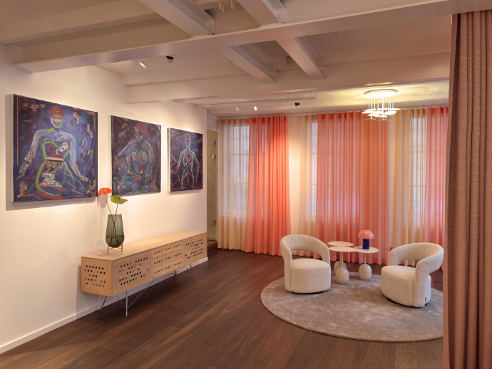
At Véo Health in Berlin-Mitte, the practice was deliberately designed not to feel like a conventional medical environment. Studio De Schutter developed a warm, restrained concept using 2700 Kelvin, very high colour rendering and dimmable lighting solutions.
The first impression therefore communicates not clinical efficiency, but calm, care and trust.
The luminaires themselves remain visually restrained. The light does the communicating.
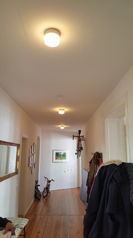
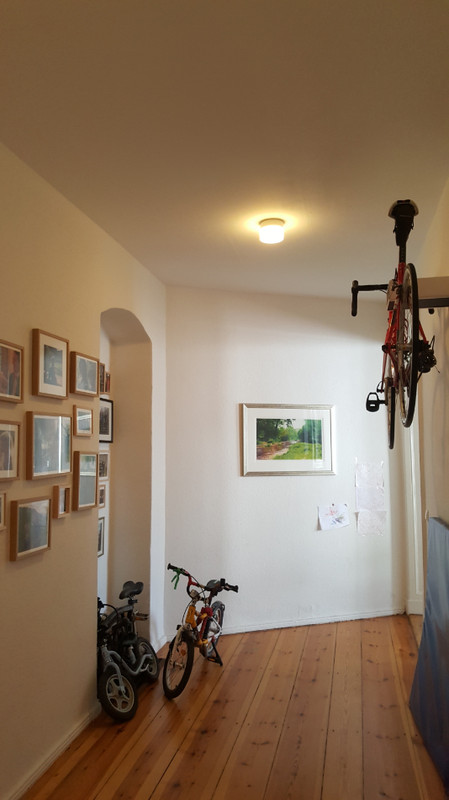
In apartments and smaller buildings, the entrance often functions simultaneously as corridor, wardrobe and distributor.
The temptation is to run a row of ceiling luminaires as evenly as possible through the entire area.
Functionally, that can work.
Spatially, however, it can quickly create long, monotonous sequences of light.
A more interesting question is: Which few points actually need light?
- the area immediately behind the door
- wardrobe or storage
- a wall with artwork or material texture
- the next doorway or opening
- the end of the corridor as a visual destination
Even simple ceiling luminaires can work better when they are understood not merely as a technical grid, but as a rhythm along the path of movement.
Orientation is often only discussed once additional signage appears necessary.
Yet architectural differences in brightness can already achieve a great deal before that point.
A brighter wall in the distance draws the eye. An illuminated staircase makes continuation visible. Light at different heights can make a large volume easier to understand. Repeated lighting motifs can connect several areas.
The visitor is not following a luminaire.
They are following visual clarity.
Not every entrance area should be treated as a neutral transitional space.
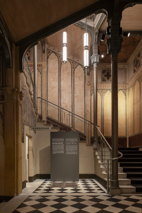
At the Centrum Judaicum in Berlin, the building itself is an essential exhibit.
The lighting design therefore had to provide orientation while simultaneously respecting the historic architecture.
Existing and new interventions were coordinated so that historic elements were affected as little as possible. In the stairwell, the original idea of architect Eduard Knoblauch was revisited: the staircase had been conceived as a light shaft for the centre of the building.
Existing pendant luminaires were upgraded with dynamic white light, allowing them to respond to the natural course of daylight.
Movement through the building is therefore not only illuminated functionally.
It remains connected to the original spatial idea.
During the day, we often look from a brighter exterior environment into a darker interior.
At night, we look from darkness towards an illuminated building.
The same glazing suddenly behaves very differently.
Reflections change. The interior becomes more visible from outside. Bright luminaires become noticeable from a distance. Reception can become part of the façade composition.
Entrance lighting should therefore be checked from at least these perspectives:
- from outside towards the entrance door
- directly in front of the threshold looking into the interior
- immediately after entering
- from inside looking back towards the exit
- during daylight and in complete darkness
What creates orientation during the day can create glare at night.
A good solution understands both conditions.
Not every entrance requires the same combination.
Even so, it helps to think in terms of tasks rather than luminaire types.
A vertical surface, door or architectural zone makes the entrance identifiable from a distance.
Steps, ramps, surface changes and obstacles must remain clearly readable without unnecessary overlighting.
Light directly around the door supports the transition between outside and inside as well as the handle, access control and recognition of faces.
Walls, signage and faces often provide more orientation than additional brightness on the floor.
Reception, stairs, corridor or a brighter destination take over guidance after entering.
Daylight, evening operation, night mode and cleaning do not necessarily require the same distribution or intensity of light.
- illuminating only the door itself but not the approach
- planning exterior and interior lighting separately
- uniformly brightening the entire entrance forecourt
- considering only horizontal illuminance
- forgetting the first destination beyond the door
- planning a bright reception desk while faces remain dark
- making steps or floor changes visible only at close range
- accepting glare directly within the natural sightline
- checking glass reflections only during the day
- not viewing the entrance from outside at night
- filling small entrance areas with too many ceiling luminaires
- treating entrance, foyer and subsequent circulation as separate lighting worlds
The objective is not to show as much light as possible as early as possible.
The objective is to make the right information visible at the right moment.
Before selecting specific luminaires, it is worth checking the space along the actual route of movement.
Approach · Recognise · Reach · Open · Adapt · Orient · Continue
Walk this route yourself.
Not only on plan.
At eye level. In daylight. In darkness. With the door open and closed.
At every step, ask: What information do I need right now?
Only then should the question become which luminaire solves that task best.
This is exactly why both areas should be planned together without being confused with one another.
Entrance lighting focuses on approach, threshold, adaptation and the first directional decision.
The foyer introduces additional topics: reception, spatial height, waiting areas, lighting scenes and distribution into the rest of the building.
Read more about lighting design for foyers and reception areas →
Good entrance area lighting connects orientation, safety and the transition between outside and inside. Rather than illuminating the whole area uniformly, the entrance door, paths, level changes, vertical surfaces and the first destination beyond the door should remain clearly legible.
A single universal brightness level is not particularly useful. Use, daylight, building type, materials and relevant requirements should be considered together. The relationship between the entrance, its surroundings and the adjoining interior spaces is equally important.
The right colour temperature depends on architecture, materials and use. Hotels, residential buildings and hospitality projects may work with warmer light, while other building types may require a more neutral appearance. Colour temperature should always be considered together with brightness and colour rendering.
People orient themselves through doors, walls, faces, signage and openings. Most of this information lies within the vertical field of view. A well-lit wall or clearly visible reception desk can therefore provide more orientation than additional brightness on the floor.
The entrance area primarily covers the sequence of approach, door, threshold and first orientation after entering. A foyer focuses more strongly on occupation, reception, spatial volume and further distribution within the building.
Daylight significantly changes the brightness relationship between outside and inside. At night, interiors behind glazing become more visible and reflections change. Good lighting design therefore considers both the view into the building and the appearance of the illuminated entrance from outside.
Ideally, it should be developed together with the architecture, façade and interior design from an early stage. Door positions, canopies, glazing, paths, steps, signage, electrical connections and subsequent circulation all directly influence the lighting concept.
Light connects exterior space, threshold and the first interior into one understandable arrival sequence.
Studio De Schutter develops architectural lighting concepts for entrances, foyers, hospitality, cultural spaces, healthcare and private architecture.
Less visual noise. Clearer routes. More precise transitions.
From the first glance to the first step inside.

Contact Us:
