Planning Showroom Lighting: How True Radiance Is Created
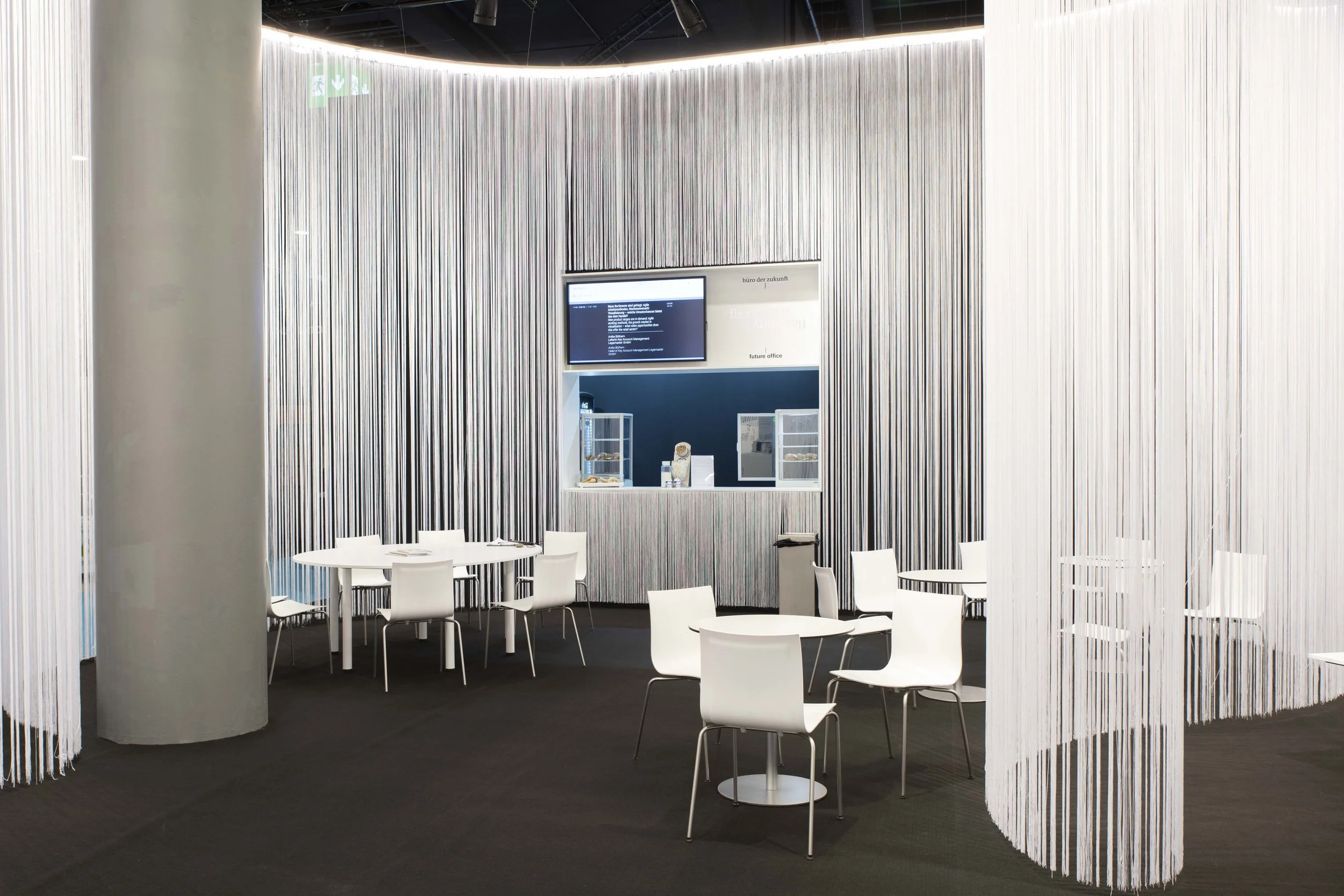
A showroom is not a warehouse with a beautiful floor.
It is a stage. A statement. And often the first real encounter with a brand.
People do not come only to see products. They come to sense whether it fits. Whether quality feels tangible. Whether the details truly hold up. And this is exactly where lighting design begins.
In showrooms, light is not decoration.
It is communication.
It says: Welcome. Look closer. Stay a moment. Or: This is premium.
Why Showroom Lighting Is More Than “Bright”
Many showrooms are simply bright.
And yet they feel flat. Because brightness alone does not create impact.
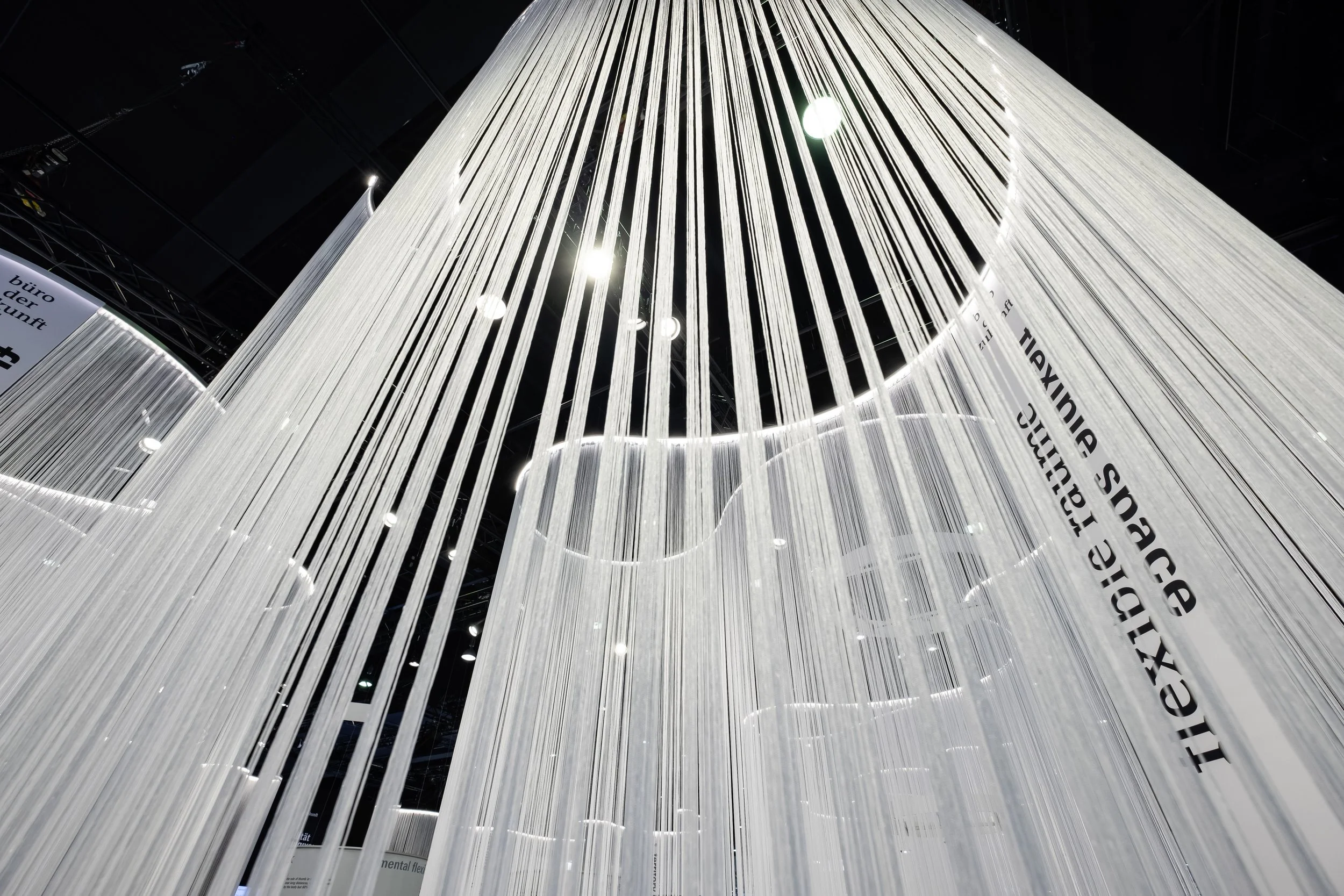
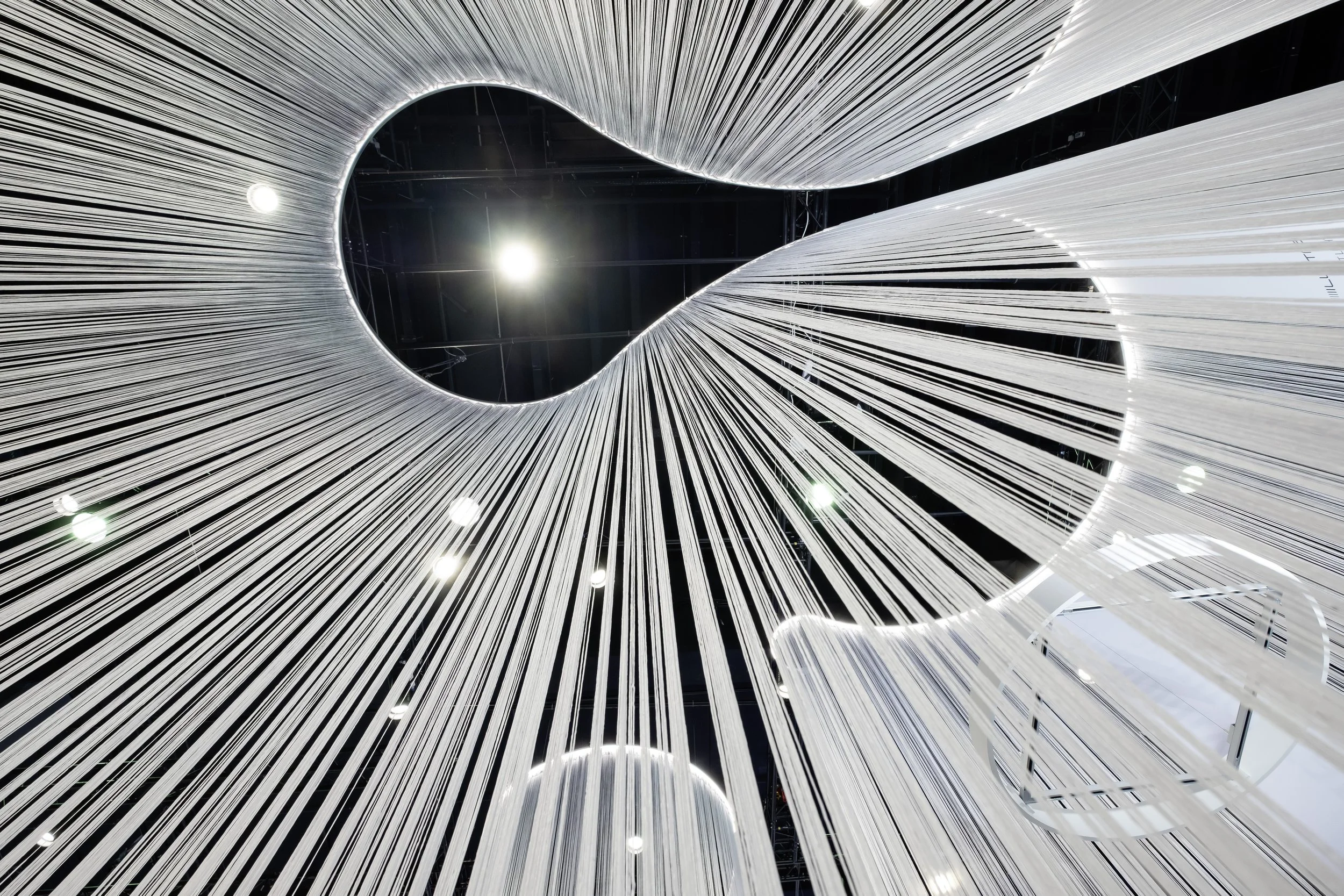
Radiance is created through contrast. Through focus. Through rhythm.
A well designed lighting concept guides the eye without announcing itself. It makes products legible. It gives surfaces depth. It allows colours to appear credible. And it creates an impression that lingers.
In short: no one remembers lux levels.
They remember how it felt.
Light is the quiet way of saying: This is important.
The Principle of Radiance: Three Layers of Light
A showroom does not work through “more light.”
It works through structure.
Radiance emerges when light forms layers that complement each other and are deliberately aligned. No random spot placement. No rigid grid logic. Instead, a clear spatial dramaturgy.
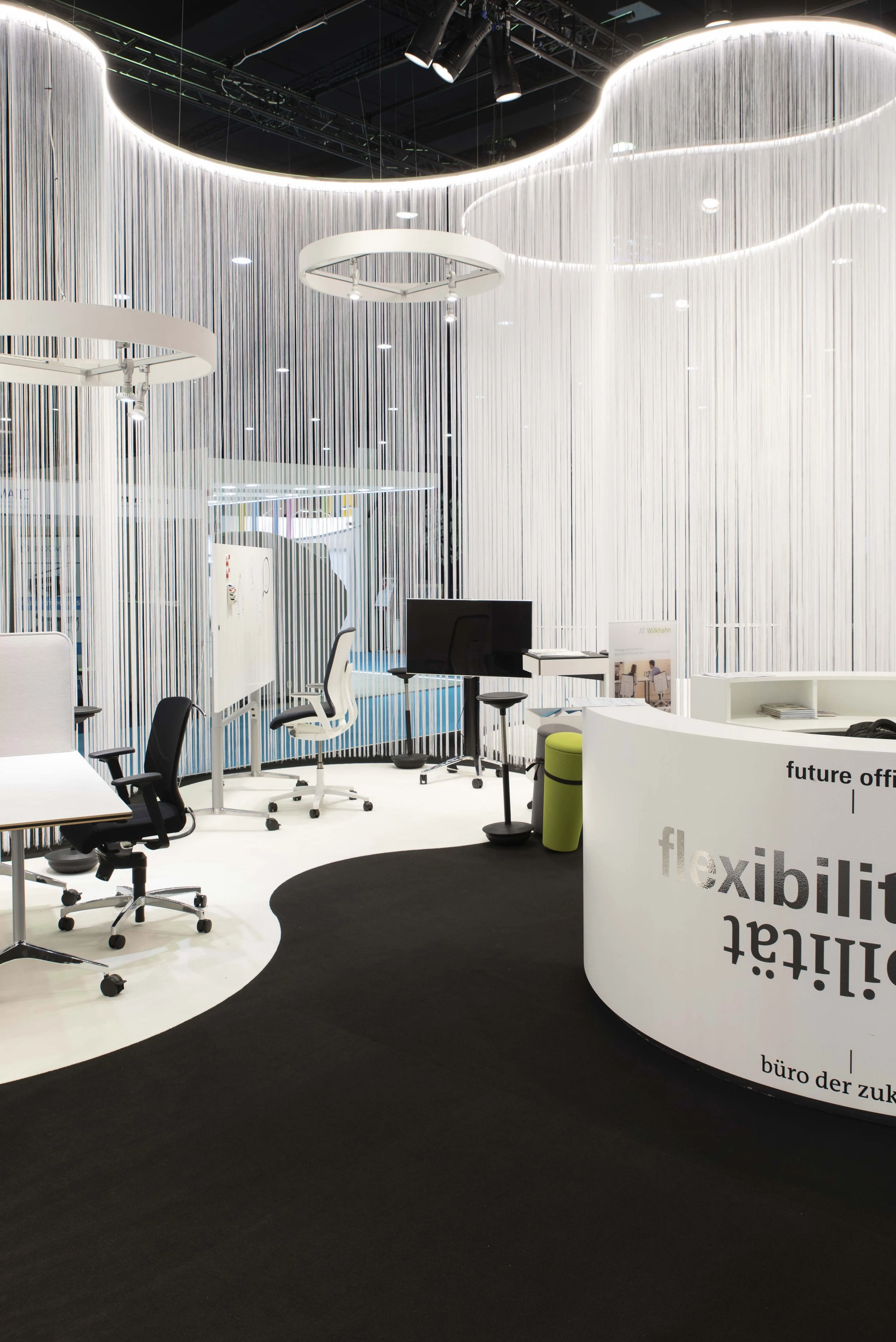
1) Ambient Light – the Stable Foundation
It provides orientation, safety, and visual calm. Even, glare free, restrained.
Ambient light forms the base. It holds the space together and remains flexible, even when products or layouts change.
2) Accent Light – the Targeted Focus
This is where relevance is created. Products are highlighted, materials gain dimensionality, and details become precisely legible.
Contrast creates hierarchy.
And hierarchy makes a showroom understandable.
3) Connecting Light – Spatial Depth
Light on vertical surfaces and transitional areas adds dimension. It prevents harsh breaks between bright and dark and creates visual balance.
This layer is subtle.
But essential.
Light Guides. Always.
You cannot not guide the eye. Even in a poorly lit showroom, light directs attention — just unintentionally.
That is why sightlines are planned deliberately.
Arrival: What is seen within the first three seconds
Path: Where does a natural flow emerge
Focus: Which highlights require clear lighting signatures
Pause: Where can the eye briefly rest
A showroom with well orchestrated guidance simply feels right.
Without anyone having to explain why.
Materials Need Their Own Light
A showroom is often a mix of surfaces. Matte. Glossy. Textile. Stone. Metal. Wood. Glass.
And every surface reacts differently.
Gloss can feel refined — or cheap.
Wood can appear warm — or grey.
Fabric can feel soft — or dull.
The difference is rarely the material itself.
It is the light.
That is why we do not only test whether it is “bright enough.” We test whether materials appear as they are meant to appear. On site. With attention to reflections, glare, and viewing angles.
Design does not end at the surface.
It truly begins there.
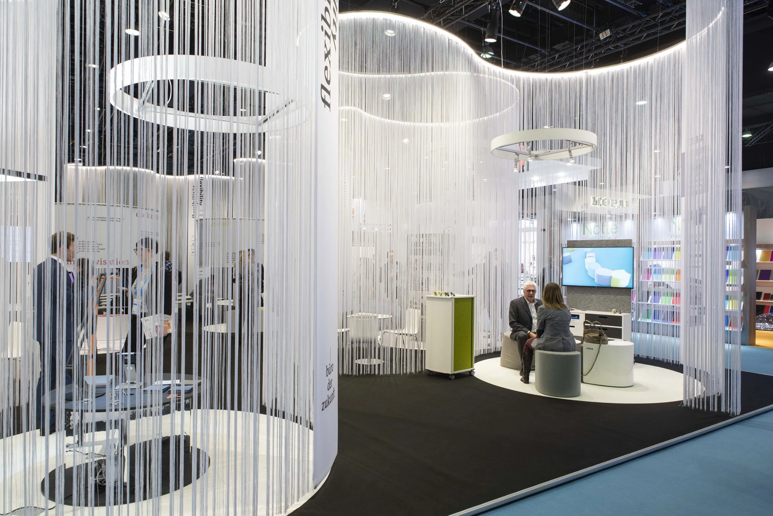
Scenes Instead of Switches
A showroom is rarely just one situation.
There is consulting. Presentation. Events. Content production. Cleaning. Daylight. Evening mood. Weekend operation.
That is why we design lighting in scenes — not as isolated light points.
Typical showroom scenes:
Welcome: warm, calm, inviting
Product Focus: clear accents, high precision
Consulting: balanced, glare free, present
Event: more dynamic, stronger contrast, emotional
Content: camera friendly, controlled, colour accurate
The goal is simple:
The space adapts — without becoming complicated.
Showroom Lighting Checklist ✓
If you can tick off the following points for your showroom, your lighting concept is structured, precise, and aligned with your brand. This checklist is not about adding more luminaires — it is about quality in perception.
01A clear visual hierarchy is defined
Visitors immediately understand where the focus lies. Key products stand out, supporting areas remain intentionally restrained.
- the first impression is clearly guided
- products do not compete visually
- the space feels structured rather than flat
02Products are presented with precision and credibility
Materials retain their depth. Colours appear authentic. Light supports the product — it does not overpower it.
- textures remain visible
- surfaces appear refined
- highlights are controlled and intentional
Light reveals quality — it does not replace it.
03Vertical surfaces are intentionally illuminated
Walls and backgrounds actively contribute to spatial perception. The showroom gains depth and generosity.
- products clearly separate from the background
- the space feels larger and calmer
- lighting creates spatial balance
04Glare is carefully controlled
Beam angles and reflections are tested and refined. Light remains present without causing visual discomfort.
- no direct glare in primary sightlines
- reflective materials are properly considered
- the overall impression remains calm and confident
05Lighting is organized in adaptable scenes
The showroom responds flexibly to different uses: consulting, events, content production, daylight changes.
- clearly defined lighting scenes
- intuitive operation
- adaptability without technical complexity
Good lighting design makes adaptation feel effortless.
Studio De Schutter: Showroom Lighting as a Brand Instrument
As lighting designers based in Berlin, we approach showrooms as spaces with a voice.
Not loud.
But unmistakable.

We combine technical clarity with spatial quality. Function with identity. Precision with emotion.
So that a showroom does not become just a “beautiful space,” but an experience that sells — without pushing.
Contact Us:
