

Two luminaires. Both 3000 Kelvin. Both bright enough.
Under one, the timber looks warm, skin looks vivid and the red fabric appears deep.
Under the other: everything feels slightly flatter.
The difference may lie in the spectrum. And this is where the Colour Rendering Index begins.
CRI is an important measure of light quality. But it never tells the whole story.
with the defined reference
The Colour Rendering Index describes how similar colours appear under an artificial light source compared with a defined reference illuminant.
In simple terms:
Does the light strongly alter the colours of skin, fabrics, timber, food or surfaces?
Or do they remain close to their reference appearance?
The higher the Ra value, the smaller the average colour shift across the test colours used in the method.
The maximum value is 100.
But an important detail is already hidden here: CRI evaluates colour fidelity. It does not automatically measure beauty, saturation, preference or the overall quality of a light source.
It is the way the colour changes.
A defined reference illuminant provides the comparison standard for the respective colour temperature.
The smaller the deviation across the test colours, the higher the Colour Rendering Index.
not see
every colour.
When a luminaire is labelled “CRI 90”, this usually refers to the general Colour Rendering Index Ra.
This value is calculated from the first eight test colours: R1 to R8.
This is why a light source can have a good Ra value while still rendering red significantly less effectively.
An average can be identical even when the individual values behind it are distributed differently.
That matters enormously in colour rendering.
Two light sources can both achieve Ra 90.
One may render red particularly well while performing slightly less strongly elsewhere.
The other may reach the same average with a completely different spectral distribution.
In a standard office, that difference may not be critical.
In fashion, food, skin, art or high-quality interior materials, it can become clearly visible.
is not always CRI 90.
Ra 80 is a common minimum level in many interior applications. Colours remain clearly distinguishable, but may appear less nuanced than under higher-quality spectra.
For high-quality interiors, hospitality, retail, architecture, skin tones and material-focused projects, higher colour rendering is often worthwhile.
Very high values can be valuable for particularly colour-critical applications. But spectrum, individual values, light distribution, dimming and the application itself still have to work together.
CRI 95 sounds better than CRI 90.
In terms of average colour fidelity within the CRI method, it may well be.
But that does not automatically make the luminaire the better solution for the space.
A poorly shielded CRI 95 luminaire can still glare.
The wrong light distribution remains wrong.
An unsuitable colour temperature remains unsuitable.
And a luminaire with visible flicker does not become high-quality simply because its colour rendering is excellent.
CRI evaluates one part of light quality. Not the entire lighting concept.
brighter.
Better
light.
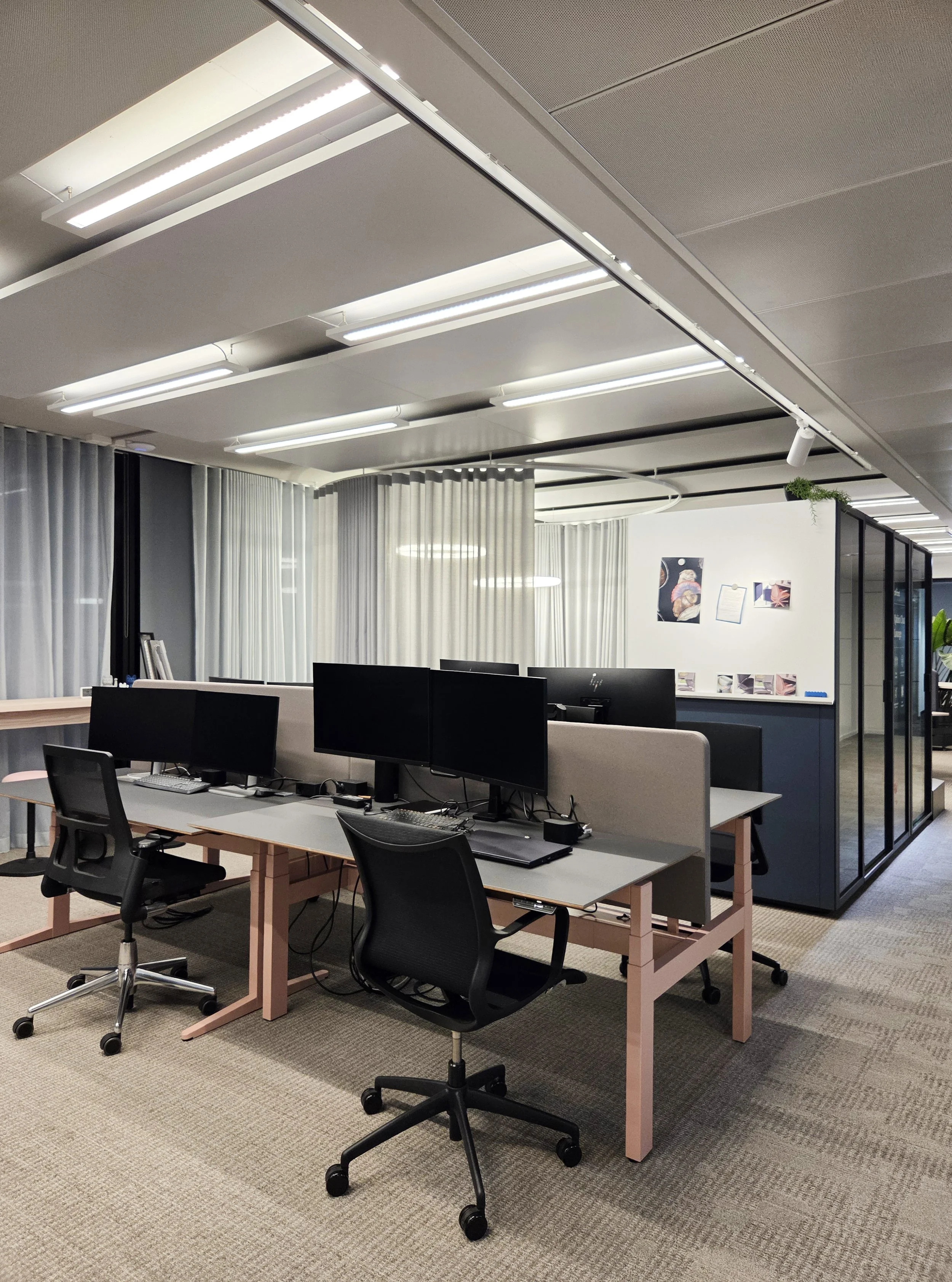
At The Loop, the existing office luminaires were not simply replaced with new ones.
They were technically developed further.
Fluorescent tubes · 4000 K · higher flicker
LED · 3000 K · flicker-free
The example matters because more than one number changed.
The light source, colour temperature, colour rendering, flicker characteristics and controls were all improved together.
This is how light quality should be considered: as a system – not as a single value on a data sheet.
Kelvin describes how warm or cool white light appears.
2700 K appears warmer. 4000 K more neutral.
Kelvin does not tell us how accurately colours will appear under that light.
CRI describes how closely colours under a light source resemble those under a defined reference illuminant.
Two luminaires with 3000 K can therefore have completely different CRI values.
And make materials look correspondingly different.
This is one of the most common misunderstandings.
Warm light can feel pleasant.
But if important spectral regions are missing, skin, timber, textiles or food can still appear flat.
Conversely, a more neutral colour temperature can have excellent colour rendering.
Colour temperature describes the white. Colour rendering describes what happens to the colours beneath it.
R9 evaluates the rendering of a strongly saturated red.
This value is not included in the general Ra average based on R1 to R8.
Yet red is important in many applications.
Skin contains red components. Meat and food. Timber. Fabrics. Art. Lips. Warm interior materials.
A luminaire can therefore show a good Ra value on the data sheet while these colour areas still appear noticeably weaker.
Anyone taking light quality seriously should therefore look beyond Ra in colour-critical applications.
No.
CRI 100 means that the evaluated colours within this method correspond very closely to the defined reference.
It does not automatically mean:
- perfect glare control
- perfect light distribution
- perfect colour temperature
- no flicker
- optimal energy efficiency
- the best lighting mood for every use
- that people will subjectively prefer this light source
increasingly looks beyond Ra.
The familiar general Colour Rendering Index. Widely used, easy to compare and still highly relevant in specifications and standards.
The more modern Fidelity Index uses 99 colour evaluation samples and a more contemporary calculation method. The CIE now recommends actively encouraging its broader use.
TM-30 looks not only at average colour fidelity, but also at gamut or saturation changes and hue-specific colour shifts.
Because an established metric does not become worthless simply because more advanced methods exist.
Ra is understandable. Widely available in data sheets. Deeply embedded in lighting design and standards.
For an initial quality comparison, it remains useful.
The problem begins when this one number is turned into a complete judgement about light quality.
CRI is a filter. Not the final verdict.
the same priority.
Fashion, cosmetics, materials and food can respond particularly sensitively to the spectrum of the lighting.
A restaurant or hotel needs more than pleasant light. People, food and materials all have to be rendered convincingly.
Especially in architecture, design, creative work or showrooms, higher colour rendering can matter much more than in a purely functional space.
Wherever skin, tissue or other colour differences need to be assessed, colour rendering has to be specified particularly carefully.
Natural stone, timber, textiles, art and skin tones can look noticeably different under different spectra.
Here, the question “How high is the CRI?” is often not enough. Spectrum, individual values and more differentiated colour-rendering metrics can become decisive.
“Luminaire, 3000 K, CRI 90.”
That already sounds quite precise.
But only partly.
For demanding applications, additional information may also matter:
- R9 and other individual colour-rendering values
- Rf and Rg or TM-30 data
- colour temperature and chromaticity
- colour consistency between multiple luminaires
- flicker
- dimming behaviour at low levels
- light distribution and glare control
- power and efficiency
- the actual materials used in the project
And that final point is often underestimated.
A data sheet can tell you a lot.
A mock-up using the real materials can sometimes tell you more.
before approving a luminaire.
- What is the Ra value of the light source?
- Is Ra 80 sufficient for the application, or is higher colour fidelity useful?
- How important are skin tones in the space?
- How important are red, timber, food, textiles or warm materials?
- Is the R9 value known?
- Are further individual values available?
- Are TM-30 or Rf/Rg data available?
- What colour temperature does the luminaire use?
- How consistent are multiple luminaires with one another?
- How does the light behave when dimmed?
- What about flicker, glare and light distribution?
- Have the real project materials been tested under the planned light source?
- Does higher colour rendering genuinely suit the task – or is a larger number simply being specified?
CRI stands for Colour Rendering Index. It describes how similar colours appear under a light source compared with a defined reference illuminant.
Ra is the general Colour Rendering Index and is calculated from the first eight test colours, R1 to R8. In everyday use, CRI and Ra are often used almost interchangeably.
CRI or Ra 80 is a common quality level for many standard applications. In spaces where skin, materials, products or colours play an important role, Ra 90 or higher may be more appropriate.
A higher Ra value generally indicates higher average colour fidelity within the CRI method. But the decision should not be based on this number alone. Individual values such as R9, the spectrum and overall light quality remain relevant.
R9 is a specific colour-rendering value for saturated red. It is not included in the calculation of the general Ra value based on R1 to R8, but it can be important for skin tones, food, timber, textiles and other red or warm colour areas.
No. Kelvin describes the colour temperature of the white light, meaning whether it appears warmer or cooler. CRI describes how the colours of illuminated objects are rendered. Two light sources can have the same colour temperature and still have different CRI values.
CRI 100 represents maximum agreement within the CRI evaluation method. The value does not indicate whether glare, flicker, light distribution, dimming, energy efficiency or colour temperature are optimal for the space.
TM-30 is a more differentiated method for evaluating the colour rendering of light sources. It considers colour fidelity, gamut or saturation changes and hue-specific shifts, providing information that a single Ra value cannot show.
can describe
light.
But it cannot
design a
room.
Which materials are in the space? Which colours matter? Will people be looking at skin, products, art or food?
And is a single Ra value sufficient for that decision at all?
Studio De Schutter considers colour rendering as part of a complete lighting system – together with spectrum, colour temperature, distribution, glare, control and architecture.
Contact Us:
