Planning Atmospheric Lighting: The Most Important Factors at a Glance
Atmosphere is not created by “beautiful luminaires” alone, but through the interplay of brightness, direction, shadow, light color, color rendering, surfaces, daylight, and control.
Good lighting supports vision, shapes the emotional effect of a space and — when timing and intensity are right — can also influence wellbeing and biological rhythms.
For workplaces in Germany, ASR A3.4 and DIN EN 12464-1 form the reliable framework; the standards describe quality objectives, but do not prescribe a rigid luminaire solution.
This is exactly where the planning opportunity lies: technically sound, creatively free, and focused on the user.
It is especially important to understand daylight not as a “bonus”, but as part of the lighting concept.
ASR A3.4 makes clear that daylight should be preferred over exclusively artificial lighting, while the DIN 5034 series supplements planning with requirements and calculations for daylight in interiors.
Anyone planning atmosphere therefore always plans windows, visual connection, sun protection, control, and the transition between daylight and artificial light at the same time.
Executive SummaryThe safest shortcut to atmospheric lighting is not “warmer” or “darker”, but layering instead of lighting everything evenly: ambient light for orientation, accent light for focus, and mood light for depth.
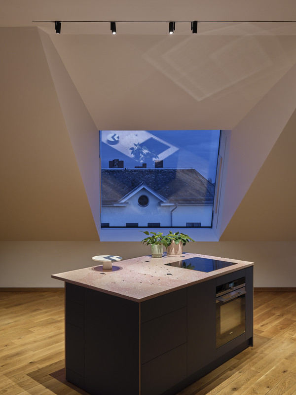
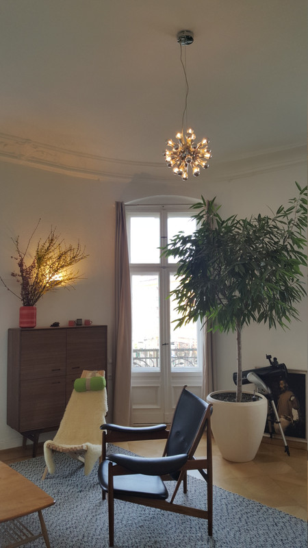
Spaces almost always work better with several islands of light than with a single central ceiling fixture; for a living room of around 20 m², licht.de recommends at least three, ideally five luminaires as a guideline.
Light color and color rendering determine whether a space feels cozy, calm, clear, or objective.
Atmosphere needs dimmability. For workplaces, ASR names 500 lx in the task area and 300 lx in the surrounding area as important reference values; in restaurants, hotels, or residential spaces, atmosphere usually only really works when these functional levels are separated from scenically dimmable evening and transitional situations.
A reliable lighting concept begins with three simple questions:
What mood should be created?
What needs to be seen safely and comfortably in this space?
How does the space change between daylight, use, and time of day?
Before product selection
- Define the target mood
- Define visual tasks
- Mark spatial zones
- Check daylight
Before implementation
- Plan ambient light
- Plan accent light
- Plan mood light
- Define scenes and dimmability
In practice, planning works most reliably in this order: first, define the target image — cozy, dramatic, neutral, representative, focused, calming.
Second, name the visual tasks — reading, working at a screen, dining, presenting, arriving, navigating, viewing exhibits, care, or treatment.
Third, mark the spatial zones — center, walls, tables, counters, circulation areas, sightlines, niches, art, material samples.
Fourth, check the daylight — window orientation, glare risk, reflections, room depth, visual connection to the outside.
Fifth, define the lighting layers. Sixth, define scenes and dimming curves.
The basic rule is: atmosphere is the result of relationships, not individual values.
A space feels cozy when brightness is graduated, focal points emerge, and bright zones do not tell everything at once.
A dramatic space thrives on narrower beams, a darker surrounding field, and intentional contrast. A neutral or objective space needs more even ambient brightness, good vertical illumination, and calm transitions.
For color rendering, a simple practical rule applies: Ra 80 is the baseline, Ra 90 is the quality level.
For restaurants, museums, display cases, material samples, food presentation, diagnostics, or high-quality interior materials, Ra 90 is almost always worthwhile because food, skin tones, fabrics, stone, wood, and artworks appear more natural and more refined.
Ambient light
Creates safety, legibility, and orientation.
Accent light
Guides the eye, models surfaces, and makes hierarchies visible.
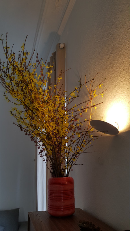
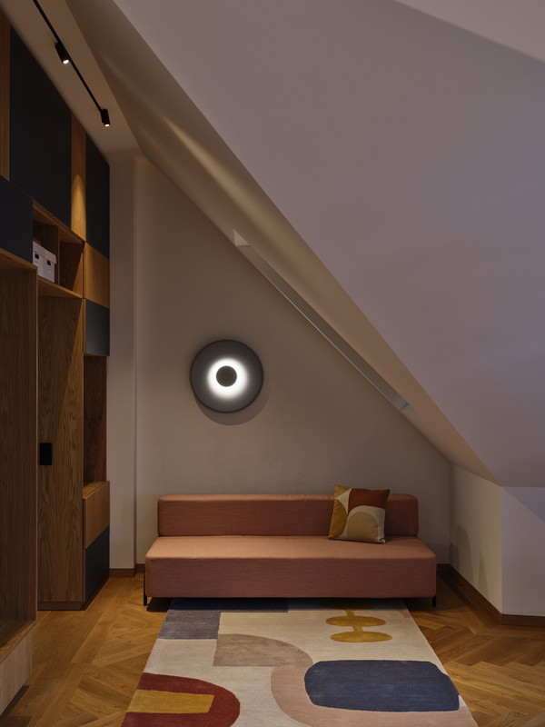
Mood light
Creates intimacy, depth, and calm.
Contrast
Makes materiality, plasticity, and spatial depth visible.
Spaces feel especially harmonious when direct and indirect light are used together.
Purely indirect light can quickly make a space feel diffuse and shadowless; overly directional light creates deep shadows and can make use more difficult.
Shadow and contrast are not the enemy of atmosphere, but its tool.
Material and surface also help determine the success of the lighting. Bright ceilings and walls are not a side issue, but part of the lighting system.
Anyone who loves dark materials must either provide more light or organize lighting efficiency more deliberately.
.jpg)
| Space type | Good planning starting point |
|---|---|
| Living space | Warm white in cozy areas, several islands of light instead of one single luminaire, dimmable ambient and mood lighting. |
| Hotel and restaurant | Separate switching groups, fully dimmable system, scenes for day and evening; functionally secure reception and work areas. |
| Office and planning | 500 lx in the visual task area, 300 lx in the surrounding area, low-glare direct/indirect combination, good vertical brightness, and daylight control. |
| Exhibition | Wallwash plus variable spots, track systems, exchangeable optics, precise handling of contrast and glare. |
| Clinic and care | Low-glare, orienting, high indirect component in circulation areas; bright, calm situations during the day, reduced levels at night. |
The right product choice is never an end in itself. An LED strip, a downlight, or a pendant luminaire is not “good” or “bad” in itself; it is either suitable or unsuitable for the desired effect.
The decisive question is therefore always: What contribution should this component make to the mood of the space?
| Type | Suitable for | What to look out for |
|---|---|---|
| LED strips | Indirect coves, niches, furniture, handrails, linear light edges | Diffuser or profile solution instead of exposed points of light; dimmable driver; sufficient cooling and clean installation. |
| Downlights | Calm ambient brightness or accented walls, scallops, counters, reception | Suitable beam angle, deep glare control, correct wall distance, dimmability, and reflection control. |
| Wall luminaires | Soft indirect light, corridors, residential and hotel zones, patient rooms | Pay attention to glare-free light-emitting surfaces and calm luminance levels. |
| Pendant luminaires | Tables, counters, meetings, desks | Check direct/indirect component, glare control, mounting height, dimming behavior, and zoning. |
| Controls | Scenes, daylight, presence, calendar, zones, later reuse | Combine automation with simple manual operation. |
When the budget is tight, one should not try to imitate a high-end system cheaply.
It is better to consistently prioritize the few effective levers: vertical brightness, dimmability, zoning, and glare control usually create more atmosphere than an expensive luminaire object without a concept.
.jpg)
A simple three-zone logic of ambient light, task light, and accent works better. Even two additional islands of light often transform a space more than replacing the entire ceiling luminaire.
Use cases| Living room | Calm with reserves for reading, conversations, and evening use. |
| Boutique hotel | Bright, clear arrival during the day; calmer, more intimate lighting mood in the evening. |
| Planning office | Atmosphere must not undermine visual performance. |
| Gallery or exhibition | Here, light is almost always a question of hierarchy. |
| Clinic and care | Safety, orientation, calm, and treatment must be scenically separated. |
- Define light groups and scene names before installation: for example “Arrival”, “Work”, “Dinner”, “Cleaning”, “Night”.
- Test on site in daylight and at dusk.
- Adjust spots, wallwashers, and pendants with furniture, images, fabrics, and real surfaces in place.
- Check reflections on glass, glossy floors, metals, and screens deliberately.
- Test dimming behavior: minimum level, flicker-free performance, uniformity, compatibility between LED, driver, and dimmer.
- Check sensors: presence, run-on time, daylight regulation, manual override.
- Document replacement and maintenance specifications: not only watts and lumens, but also Kelvin, CRI, optics, and MacAdam/SDCM.
It is a design translation: from the usage concept through architecture, material, and daylight to the scene on the switch or in the app.
When you think about mood, visual task, lighting layers, surfaces, and control in exactly this order, the system becomes not only more beautiful, but also more plausible, more robust, and more convincing in the long term.

Contact Us:
