

Office Light Colours: How Warm or Cool Should Office Lighting Be?
3000 Kelvin or 4000 Kelvin?
This question comes up in office lighting almost every time.
And it sounds as if the decision were simply between warm and focused.
Office lighting does not work that simply.
The right colour temperature depends not only on the task, but also on daylight, materials, spatial character, duration of use, controls and the question of which light actually reaches the people in the room.
4000 K = work.
Convenient.
But too simple.
Colour temperature initially describes whether white light appears warmer or cooler.
But it does not automatically tell us whether a luminaire is comfortable.
It tells us nothing about glare. Colour rendering. Flicker. How light is distributed through the room. Or how much of that light actually reaches the eye.
Two offices with 4000 K can therefore feel completely different.
And two 3000 K solutions may be almost impossible to compare in terms of quality.
Kelvin is a characteristic of light. It is not a quality rating.
A rough classification can be useful.
But it should not be confused with a fixed rule assigning one value to one type of room.
Can work in deliberately residential retreat, lounge or hospitality-inspired areas. For an entire workplace, it is usually a very conscious design decision.
Can work just as well in work areas as in communication zones — provided light quality, intensity, distribution and glare control are right.
Visually sits between classic 3000 K and 4000 K and can be interesting when an office should feel neither distinctly warm nor technically neutral.
Very common in offices. It often appears clearer and more neutral, but it is neither automatically more compliant nor automatically better for every space.
Window area, orientation and time of day change the colour, brightness and contrast within a room. Colour temperature should therefore always be assessed together with daylight.
Skin tones, wood, textiles, graphics and materials can look different under two light sources with the same colour temperature.
Colour temperature and brightness are experienced together. The effect of a light colour therefore cannot be considered independently of illuminance.
Direct task light, indirect ceiling light and vertical illumination can share exactly the same colour temperature and still create completely different spatial impressions.
Daylight changes. Exterior brightness changes. Use changes. A static solution can therefore work technically while still being less appropriate at certain times of day.
A modern workplace contains different situations. Colour temperature is only one possible tool for supporting those differences.
.jpg)
That is not generally true.
Office lighting needs to meet requirements such as sufficient illumination, glare limitation, uniformity and colour rendering.
The light colour itself can be warm white or neutral white.
4000 K are very common in practice — but they are not a universal requirement for every office.
That is precisely why colour temperature should grow out of the spatial concept and the intended use, rather than from an assumed standard number.
visibly warmer, often perceived as softer and more residential
more neutral, clearer and often perceived as more technical
The final point matters.
The familiar formula “warm = tired, cool = productive” is far too crude for serious lighting design.
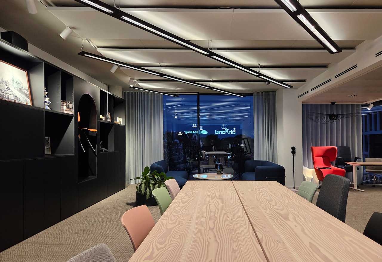
The Loop offers a particularly interesting example.
The existing office lighting originally used cooler fluorescent solutions at around 4000 K, CRI 80 and with higher levels of flicker.
During the revitalisation, the existing luminaires were not simply replaced.
They were upgraded.
The result: flicker-free LED technology with 3000 K and CRI 95.
What makes this interesting is that several quality parameters changed at the same time.
Not only Kelvin.
But also colour rendering, flicker, control and the integration of the luminaires into a new spatial concept.
That is exactly why it would be misleading to explain the difference simply as “warmer light”.
was the existing condition.
3000 K
became the new solution.
At the same time, colour rendering increased from CRI 80 to CRI 95 and the new LED solution became flicker-free.
.jpg)
Not every area automatically needs a different colour temperature.
But the opposite idea — one Kelvin value for an entire building — should not be accepted automatically either.
Glare control, illuminance, contrast, screen position and colour rendering are at least as important. 3000 K can be just as intentional a choice as 4000 K.
Good vertical illumination can matter more than a particularly high colour temperature. People should be able to communicate without harsh facial shadows or disturbing glare.
Warmer light colours and lower-positioned luminaires can work well here. The area should still remain visually connected to the wider workplace.
If rooms are used for workshops, presentations, meetings and events, dimmable or dynamic systems can be more useful than one static setting.
A computer workstation is often considered horizontally first.
Light on the desk. Light on documents. Light on the keyboard.
During video calls, however, the task changes.
Suddenly the face matters.
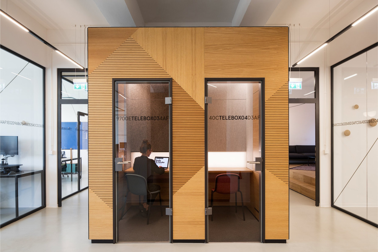
At Full Node, Studio De Schutter therefore developed a diffuse lighting surface integrated into the wall in front of the user.
The soft light reduces harsh facial shadows and supports communication on camera.
No change in Kelvin could compensate for the wrong direction of light.
Dynamic lighting systems can change colour temperature and intensity over the course of the day.
But a credible Human Centric Lighting strategy is not simply about selecting “cool” in the morning and “warm” in the evening.
Relevant factors include light quantity, spectral composition, timing, duration and the light that actually reaches the eye.
Daylight belongs in that consideration too.
Tunable White is therefore a tool.
Not a concept in itself.
Collaborate.
Concentrate.
Retreat.
One workplace.
Several work modes.
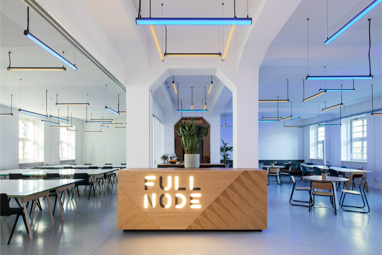
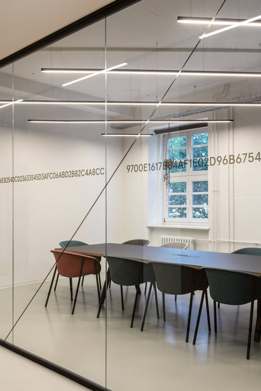
Full Node was developed for different ways of working.
Communication. Collaboration. Concentration. Retreat.
This flexibility becomes especially visible in the meetup and café area.
There, the lighting can switch between prepared scenarios for conferences, workshops and events.
RGBW light lines are suspended at different heights and in different directions.
Other areas use integrated, dimmable lighting that can be adapted to the task and desired setting.
The project therefore does not answer the question of office light with one Kelvin value.
It answers it with different lighting states for different uses.
Colour temperatures should ideally not be selected from a data sheet alone.
3000 K on white plaster.
3000 K on a warm timber surface.
3000 K next to large amounts of daylight.
These are three different spatial situations.
That is why mock-ups and samples are useful.
Do not look only at the luminaire.
Look at:
How do timber, fabric, concrete and wall colours change the effect of the light?
How large is the difference between artificial light and window light at different times of day?
How do skin tones and the eye area appear under the planned lighting?
How does the same colour temperature change once daylight disappears outside?
.jpg)
Both are possible.
Problems arise when different colour temperatures sit next to one another by accident.
For example: 3000 K in the meeting room, 4000 K in the corridor and 3500 K in the open workspace — all visible within the same sightline.
Transitions can then quickly feel like technical inconsistencies.
Differences should therefore either be deliberately designed or deliberately avoided.
One consistent light colour can create visual calm.
Dynamic or deliberately different colour temperatures, on the other hand, can make sense where use and character genuinely change.
- How much daylight does the room receive?
- At what times of day is the space used most?
- Which materials and surfaces dominate the interior?
- What is the colour rendering quality of the planned luminaires?
- How well is glare controlled?
- Which areas need vertical light on faces?
- Which rooms serve several different uses?
- Should the colour temperature remain static or be dynamically adjustable?
- Are different colour temperatures visible within the same sightline?
- How does the planned light colour appear in the evening without daylight?
- Has the solution been tested with the actual materials?
- Can users influence brightness or lighting state themselves?
- Assuming 4000 K are automatically mandatory: neutral white is common, but it is not the only professional solution for offices.
- Using 3000 K only for lounges by default: work areas can also function with warm white light when the overall concept is right.
- Confusing Kelvin with light quality: glare, flicker, colour rendering and light distribution are not described by colour temperature.
- Selecting colour temperatures without testing them against materials: surfaces can significantly change how light is experienced.
- Ignoring daylight: the same luminaire feels different in the morning, afternoon and after sunset.
- Reducing HCL to a colour change: dynamic colour temperature alone does not create a Human Centric Lighting concept.
- Mixing too many visible Kelvin values: unintended differences can make an office feel visually restless.
- Solving video calls only with desk lighting: vertical light on the face is essential.
- Planning one lighting mood for every use: focus work, meetings, presentations and events can require different conditions.
There is no universally best colour temperature. Both 3000 K and 4000 K can be suitable for office areas. Relevant factors include use, daylight, materials, illuminance, glare control and colour rendering.
No. 4000 K are very common in office projects, but they are not generally prescribed as the only acceptable colour temperature. Workplace lighting needs to meet a range of other quality and safety requirements as well.
Not necessarily. 3000 K can also work in professional work areas. The decisive factor is the complete lighting concept, including illuminance, distribution, glare limitation and colour rendering.
3000 K appear noticeably warmer, while 4000 K appear more neutral and cooler. Which option works better depends on the room, materials, daylight and intended use.
Tunable White refers to luminaires whose colour temperature can be adjusted within a defined range. This allows different lighting states and time-based sequences to be created. The technology itself, however, is not yet a complete Human Centric Lighting concept.
Yes, if the difference is conceptually justified. If different colour temperatures are directly visible within the same sightline, however, the space can quickly feel restless. Transitions should therefore be planned deliberately.
They describe different properties. Colour temperature determines how warm or cool the light appears. Colour rendering describes how faithfully colours are represented under that light. High-quality lighting design considers both.
Not cooler.
Just
right.
3000 K or 4000 K are not lighting concepts.
What matters is how artificial light and daylight work together, which activities take place, how materials respond and which light quality actually reaches the user.
Studio De Schutter therefore develops colour temperature as part of a complete spatial lighting concept.
Not every zone needs a different colour temperature. Not every workstation needs 4000 K. And not every dynamic system needs constantly changing light.
The right solution grows out of use, architecture and light quality.
Contact Us:
